
پرامپت هیرو سکشن آژانس خلاق؛ ویدیو بکگراند تمامصفحه و تایپوگرافی درشت
قیمت
رایگان
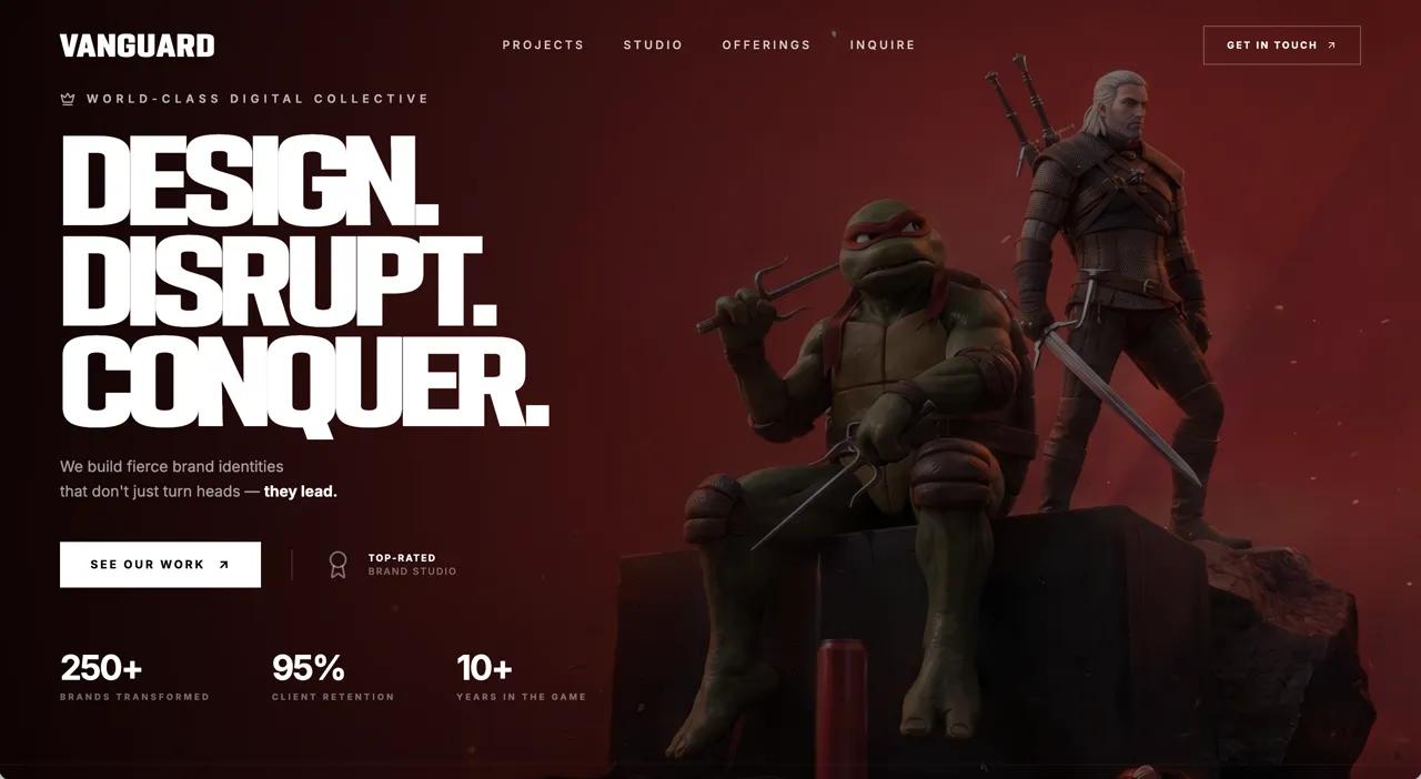
با این پرامپت هیرو سکشن آژانس خلاق یک لندینگ تمامصفحه برای آژانس خلاق با ویدیوی پسزمینه لوپ، منوی شفاف و تیتر بزرگ روی ویدیو بسازید. پرامپت کامل را در v0، Lovable، Bolt یا Cursor بچسبانید و خروجی آماده بگیرید.
پرامپت هیرو سکشن آژانس خلاق چه میسازد؟
این پرامپت هیرو سکشن آژانس خلاق یک لندینگ تمامصفحه برای آژانس خلاق با ویدیوی پسزمینه لوپ، منوی شفاف و تیتر بزرگ روی ویدیو میسازد. نمونه داخل پرامپت برای برندی به نام «VANGUARD» نوشته شده و با React + Tailwind CSS + Vite ساخته میشود. چون همه جزئیات (فونت، رنگ، فاصلهها و انیمیشنها) دقیق نوشته شده، خروجی ابزارهای هوش مصنوعی تا حد زیادی شبیه پیشنمایش بالای صفحه میشود.
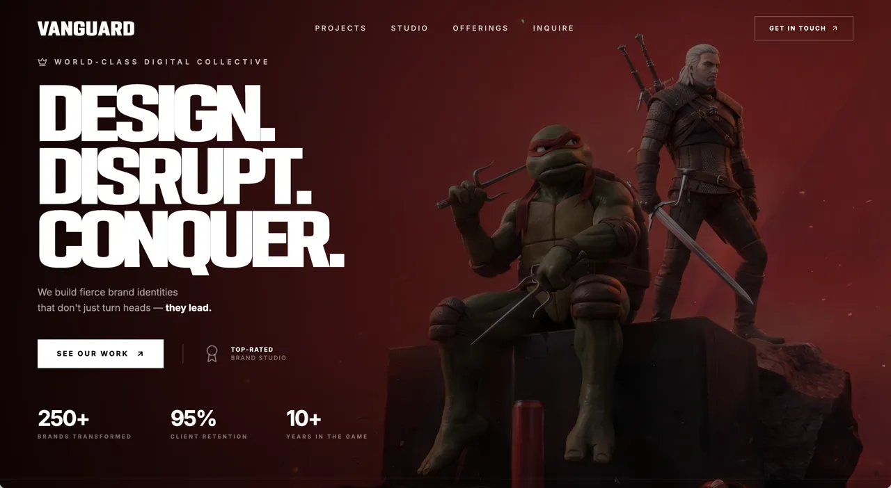
- ویدیوی پسزمینه autoPlay و muted با object-cover
- تیتر خیلی درشت و دکمههای CTA روی ویدیو
- ناوبری مینیمال و واکنشگرا
روش استفاده در v0، Lovable، Bolt و Cursor
- متن کامل پرامپت انگلیسی را کپی کنید؛ چیزی از آن را حذف نکنید.
- در v0، Lovable یا Bolt یک پروژه تازه بسازید و پرامپت را بچسبانید. در Cursor یا Claude Code، اول یک پروژه خالی Vite بسازید و بعد پرامپت را به ایجنت بدهید.
- نسخه اول را ببینید و فقط یک تغییر در هر پیام بخواهید؛ مثلاً «اسم برند را عوض کن» یا «رنگ دکمه را سبز کن».
- لینک ویدیو یا تصویر نمونه را با رسانه خودتان جایگزین کنید و نسخه موبایل را هم بررسی کنید.
نکتههای شخصیسازی
برای سایت فارسی، بعد از ساخت از ابزار بخواهید صفحه را راستچین کند و فونت Vazirmatn را جایگزین کند. تیتر و متن دکمهها را کوتاه نگه دارید تا چیدمان به هم نریزد. اگر ویدیوی پسزمینه سنگین است، آن را زیر ۳ مگابایت و با فرمت mp4 (H.264) فشرده کنید و یک تصویر پوستر هم بگذارید.
سوالات متداول
پرامپت هیرو سکشن آژانس خلاق را در کدام ابزار استفاده کنم؟
این پرامپت برای ابزارهای ساخت سایت با هوش مصنوعی مثل v0، Lovable، Bolt، Cursor و Claude نوشته شده است. متن کامل را در یک گفتگوی تازه بچسبانید تا هیرو سکشن با React + Tailwind CSS + Vite ساخته شود.
آیا میتوانم متنها را فارسی و راستچین کنم؟
بله. بعد از ساخت نسخه اول، از ابزار بخواهید dir="rtl" را روی html بگذارد، فونت را به Vazirmatn تغییر دهد و متنها را با محتوای برند شما جایگزین کند.
ویدیو یا تصویر داخل پرامپت را میتوانم استفاده کنم؟
لینکهای رسانه داخل پرامپت فقط برای نمونه هستند و مجوز MIT پرامپت شامل آنها نمیشود. برای سایت واقعی، ویدیو یا تصویر خودتان را جایگزین لینک کنید.
استفاده تجاری از این پرامپت آزاد است؟
متن پرامپت با مجوز MIT منتشر شده و استفاده، تغییر و استفاده تجاری آن آزاد است؛ فقط نام منبع (DexZane/awesome-web-prompts) را حفظ کنید.
پرامپتها و دستههای مرتبط
- پرامپت هیرو سکشن: همه پرامپتهای هیرو سکشن و لندینگ پیج
- پرامپت وایب کدنویسی
- پرامپت طراحی وب
Prompt from DexZane/awesome-web-prompts (MIT License, © 2026 DexZane)
برای دیدن پرامپتهای بیشتر در همه دستهها به آرشیو پرامپت سر بزنید.
```
Build a fullscreen hero landing page for a creative agency called "VANGUARD" using React, Tailwind CSS, and Vite. The page should be a single viewport-height section with a looping background video and all content overlaid on top.

**Background video:**
Use this exact CloudFront URL as a fullscreen `<video>` element with `autoPlay`, `muted`, `loop`, and `playsInline` attributes, set to `object-cover` to fill the entire viewport:
```
https://d8j0ntlcm91z4.cloudfront.net/user_38xzZboKViGWJOttwIXH07lWA1P/hf_20260606_154941_df1a96e1-a06f-450c-bd02-d863414cc1a0.mp4
```

**Fonts (loaded in index.html):**
1. "FSP DEMO - PODIUM Sharp 4.11" from `https://db.onlinewebfonts.com/c/8b75d9dcff6a48c35a46656192adf019?family=FSP+DEMO+-+PODIUM+Sharp+4.11` -- used for the brand name and main heading. Create a `.font-podium` utility class for it and register it in tailwind.config.js as `fontFamily.podium`.
2. "Inter" from Google Fonts (weights 400, 500, 600, 700) -- used for body text, nav links, stats, and CTAs. Register it in tailwind.config.js as `fontFamily.inter`.

**Icons:** Use `lucide-react` for all icons: `ArrowUpRight`, `Award`, `Crown`, and `X`.

**Navbar:**
- Horizontal bar at the top with responsive padding (`px-6 sm:px-10 lg:px-16`, `py-5 lg:py-7`).
- Left: brand name "VANGUARD" in `font-podium`, white, bold, uppercase, `text-2xl sm:text-3xl`, `tracking-wider`.
- Center (hidden below `md`): four nav links -- "Projects", "Studio", "Offerings", "Inquire" -- in `font-inter`, `text-sm`, `text-white/80`, `tracking-widest`, uppercase, with `hover:text-white` transition.
- Right (hidden below `md`): a "GET IN TOUCH" link with an `ArrowUpRight` icon, styled as a bordered button (`border border-white/30 hover:border-white/60`, `px-6 py-3`, `text-xs`, `tracking-widest`, uppercase, `hover:bg-white/10`).
- Right (visible below `md`): a hamburger button made of three white `div` bars (`w-6 h-0.5`, `w-6 h-0.5`, `w-4 h-0.5` with `space-y-1.5`).

**Mobile Menu Overlay (below `md` only):**
- Fixed fullscreen overlay (`fixed inset-0 z-50`) with `bg-black/95 backdrop-blur-sm`.
- Toggles visibility via React `useState` -- when open: `opacity-100 visible`, when closed: `opacity-0 invisible`, with `transition-all duration-500`.
- Header row matches the navbar: brand name on left, `X` close icon on right.
- Centered vertically: each of the 4 nav links rendered in `font-podium`, `text-4xl sm:text-5xl`, white, uppercase, with staggered entrance animations using inline `style` -- each item gets `transitionDelay: i * 80 + 100ms`, `opacity` and `translateY(20px)` transitions based on the open state.
- Below the links: a "GET IN TOUCH" bordered button with the same staggered animation pattern.
- All links call `setMenuOpen(false)` on click.

**Hero Content (vertically centered, left-aligned):**
All hero elements use staggered `animate-fade-up` animations (defined in CSS as `@keyframes fade-up` translating from `translateY(30px), opacity:0` to `translateY(0), opacity:1` over `0.8s ease-out`). Each successive element has an additional `0.2s` delay. Elements start with `opacity: 0` and use `animation-fill-mode: forwards`.

1. **Tagline:** A `Crown` icon (lucide, `w-4 h-4`, `text-white/70`) followed by "World-Class Digital Collective" in `text-white/70`, `text-xs sm:text-sm`, `font-inter`, `tracking-[0.3em]`, uppercase. Uses `animate-fade-up` (no delay). Has `mb-6 lg:mb-8`.

2. **Main Heading:** Three lines in `font-podium`, white, uppercase, `leading-[0.92]`, `tracking-tight`, each using `text-[clamp(2.8rem,8vw,7rem)]`:
   - "Design."
   - "Disrupt."
   - "Conquer."
   Uses `animate-fade-up-delay-1` (0.2s delay).

3. **Subtext:** "We build fierce brand identities" (line break) "that don't just turn heads --" then bold white "they lead." in `text-white/70`, `text-sm sm:text-base`, `font-inter`, `leading-relaxed`, `max-w-md`. Uses `animate-fade-up-delay-2` (0.4s delay). `mt-6 lg:mt-8`.

4. **CTA Row:** Uses `animate-fade-up-delay-3` (0.6s delay), `mt-8 lg:mt-10`, `flex flex-wrap items-center gap-4 sm:gap-6`.
   - Black button "SEE OUR WORK" with `ArrowUpRight` icon. `bg-black hover:bg-neutral-900`, `px-5 sm:px-7 py-3 sm:py-4`, `text-[11px] sm:text-xs`, `tracking-widest`, uppercase. Arrow has `group-hover:translate-x-0.5 group-hover:-translate-y-0.5` transition.
   - Beside it (hidden on mobile, `hidden sm:flex`): an `Award` icon (`w-8 h-8`, `text-white/50`) with two lines of text: "Top-Rated" / "Brand Studio" in `text-white/60`, `text-xs`, `tracking-wider`, uppercase.

5. **Stats Row:** Uses `animate-fade-up-delay-4` (0.8s delay), `mt-8 sm:mt-10 lg:mt-14`, `flex flex-wrap gap-6 sm:gap-12 lg:gap-16`. Three stats:
   - "250+" / "Brands Transformed"
   - "95%" / "Client Retention"
   - "10+" / "Years in the Game"
   Values in `font-inter`, white, `text-2xl sm:text-4xl lg:text-5xl`, bold, `tracking-tight`. Labels in `text-white/50`, `text-[9px] sm:text-xs`, `tracking-widest`, uppercase, `mt-1`.

**CSS Animations (defined in index.css under `@layer utilities`):**
```css
@keyframes fade-up {
  from { opacity: 0; transform: translateY(30px); }
  to { opacity: 1; transform: translateY(0); }
}
@keyframes fade-in {
  from { opacity: 0; }
  to { opacity: 1; }
}
@keyframes scale-in {
  from { opacity: 0; transform: scale(0.9); }
  to { opacity: 1; transform: scale(1); }
}
```
With classes: `.animate-fade-up` (0s delay), `.animate-fade-up-delay-1` through `.animate-fade-up-delay-4` (0.2s increments, starting `opacity: 0`), `.animate-fade-in`, `.animate-fade-in-delay`.

**Responsive behavior:**
- Full layout is mobile-first with breakpoints at `sm` (640px), `md` (768px), and `lg` (1024px).
- Nav links and "GET IN TOUCH" button show at `md`+; hamburger shows below `md`.
- Award badge hides on mobile (`hidden sm:flex`).
- All text sizes, paddings, gaps, and margins scale up through `sm:` and `lg:` prefixes.
- Stats and CTA row use `flex-wrap` to prevent overflow on small screens.

Make everything fully mobile responsive. Use a single `App.tsx` component with `useState` for the menu toggle. No routing needed.
```پرامپتهای مرتبط
مقالات مرتبط
مهندسی پرامپت
شخصیسازی پرامپت آماده؛ راهنمای گامبهگام برای گرفتن جواب حرفهای
پرامپت آماده فقط نقطه شروع است. در این راهنما یاد میگیرید با پنج لایه شخصیسازی، قالبهای عمومی را به پرامپتهایی تبدیل کنید که خروجی مخصوص کسبوکار شما میدهند.
۱۴۰۵/۸/۱۴
توسعه و برنامهنویسی
مدلهای هوش مصنوعی چینی ۲۰۲۶؛ Kimi K3، GLM-5.3، Wan3.0 و MiniMax H3
مرور تازهترین مدلهای هوش مصنوعی چینی بر اساس صفحات رسمی: Kimi K3 و K2.8 Preview، GLM-5.3، Wan3.0 و MiniMax H3؛ و اینکه برای کاربر ایرانی چه معنایی دارند.
۱۴۰۵/۸/۱۳
توسعه و برنامهنویسی
کلود اپوس ۵.۵؛ قویترین مدل Anthropic برای برنامهنویسی و پروژههای بزرگ
Anthropic در ۲۲ سپتامبر ۲۰۲۶ Claude Opus 5.5 را با عملکرد پیشرو در کدنویسی ایجنتی و ۴۰ درصد هزینه کمتر از Opus 5 معرفی کرد. راهنمای کامل برای برنامهنویسان.
۱۴۰۵/۸/۱۲
مهندسی پرامپت
ابزار هوش مصنوعی رایگان برای فارسیزبانها در ۲۰۲۶؛ چه چیزی واقعاً رایگان است؟
کدام ابزار هوش مصنوعی رایگان واقعاً به درد کار روزمره میخورد؟ راهنمای پلنهای رایگان ChatGPT، Claude و DeepSeek، مدلهای متنباز و ۷ ترفند برای استفاده بهتر.
۱۴۰۵/۸/۱۱
امتیاز و نظرات
— · 0 امتیاز
امتیاز شما