
پرامپت هیرو سکشن سایت فیلم و سریال؛ هیرو سینمایی برای پلتفرم استریم
قیمت
رایگان
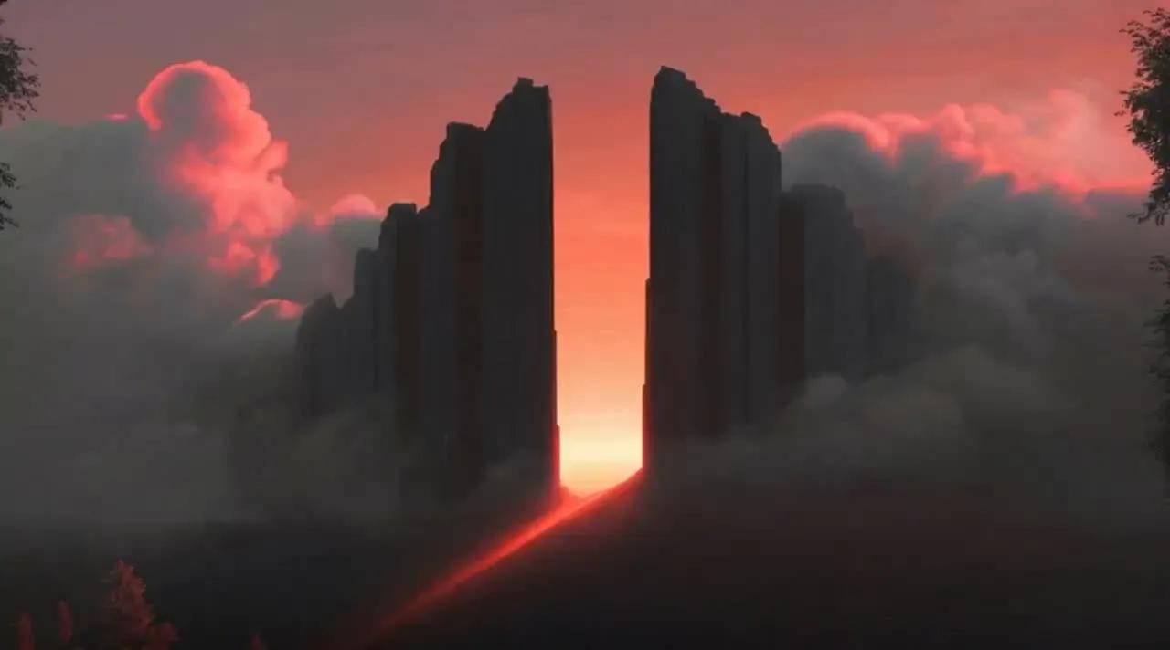
با این پرامپت هیرو سکشن سایت فیلم و سریال یک هیرو سکشن سینمایی تمامارتفاع برای سایت فیلم و استریم با ویدیوی ثابت پشت صفحه و اطلاعات فیلم روی آن بسازید. پرامپت کامل را در v0، Lovable، Bolt یا Cursor بچسبانید و خروجی آماده بگیرید.
پرامپت هیرو سکشن سایت فیلم و سریال چه میسازد؟
این پرامپت هیرو سکشن سایت فیلم و سریال یک هیرو سکشن سینمایی تمامارتفاع برای سایت فیلم و استریم با ویدیوی ثابت پشت صفحه و اطلاعات فیلم روی آن میسازد. نمونه داخل پرامپت برای برندی به نام «Portal» نوشته شده و با React + Tailwind CSS + Lucide ساخته میشود. چون همه جزئیات (فونت، رنگ، فاصلهها و انیمیشنها) دقیق نوشته شده، خروجی ابزارهای هوش مصنوعی تا حد زیادی شبیه پیشنمایش بالای صفحه میشود.
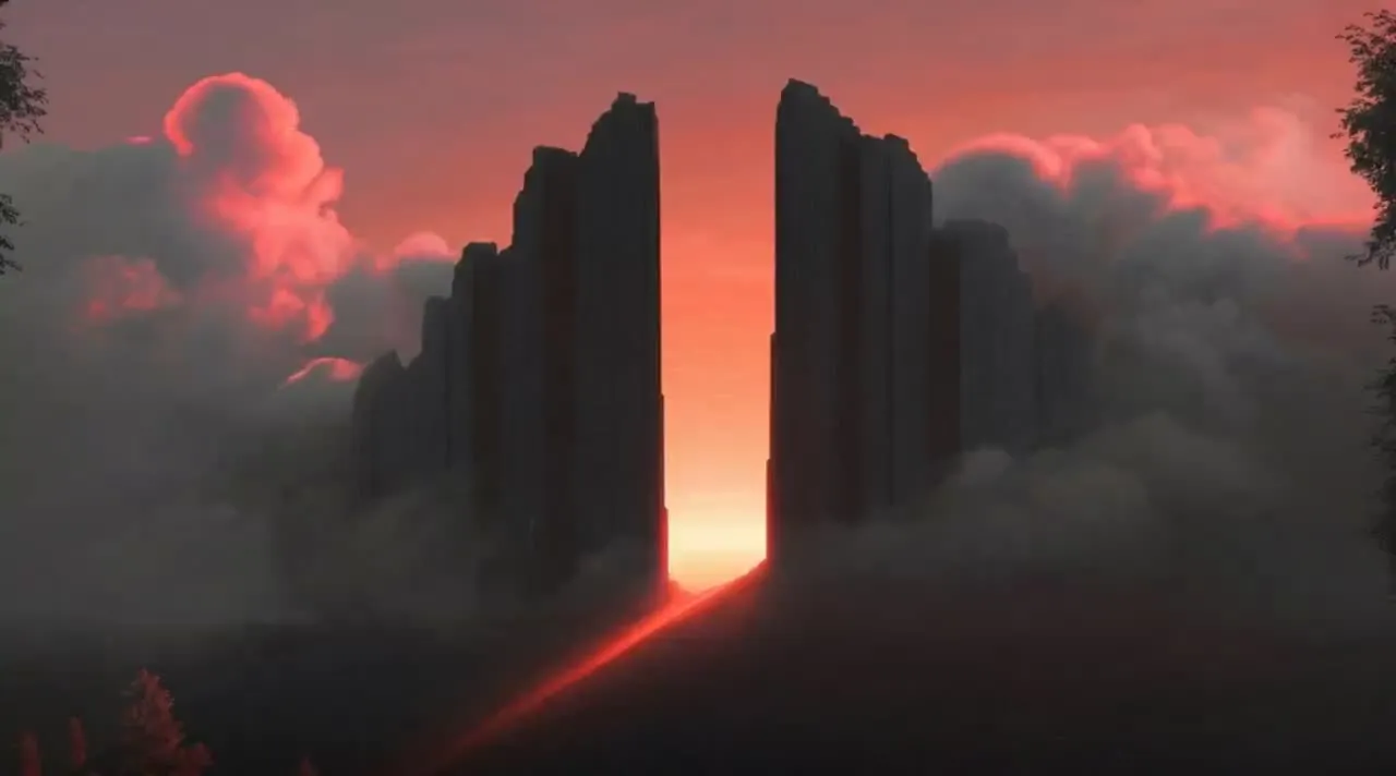
- ویدیوی fixed پشت همه لایهها
- اطلاعات فیلم، دکمه پخش و افزودن به لیست
- بدون اسکرول؛ فقط یک صفحه کامل
روش استفاده در v0، Lovable، Bolt و Cursor
- متن کامل پرامپت انگلیسی را کپی کنید؛ چیزی از آن را حذف نکنید.
- در v0، Lovable یا Bolt یک پروژه تازه بسازید و پرامپت را بچسبانید. در Cursor یا Claude Code، اول یک پروژه خالی Vite بسازید و بعد پرامپت را به ایجنت بدهید.
- نسخه اول را ببینید و فقط یک تغییر در هر پیام بخواهید؛ مثلاً «اسم برند را عوض کن» یا «رنگ دکمه را سبز کن».
- لینک ویدیو یا تصویر نمونه را با رسانه خودتان جایگزین کنید و نسخه موبایل را هم بررسی کنید.
نکتههای شخصیسازی
برای سایت فارسی، بعد از ساخت از ابزار بخواهید صفحه را راستچین کند و فونت Vazirmatn را جایگزین کند. تیتر و متن دکمهها را کوتاه نگه دارید تا چیدمان به هم نریزد. اگر ویدیوی پسزمینه سنگین است، آن را زیر ۳ مگابایت و با فرمت mp4 (H.264) فشرده کنید و یک تصویر پوستر هم بگذارید.
سوالات متداول
پرامپت هیرو سکشن سایت فیلم و سریال را در کدام ابزار استفاده کنم؟
این پرامپت برای ابزارهای ساخت سایت با هوش مصنوعی مثل v0، Lovable، Bolt، Cursor و Claude نوشته شده است. متن کامل را در یک گفتگوی تازه بچسبانید تا هیرو سکشن با React + Tailwind CSS + Lucide ساخته شود.
آیا میتوانم متنها را فارسی و راستچین کنم؟
بله. بعد از ساخت نسخه اول، از ابزار بخواهید dir="rtl" را روی html بگذارد، فونت را به Vazirmatn تغییر دهد و متنها را با محتوای برند شما جایگزین کند.
ویدیو یا تصویر داخل پرامپت را میتوانم استفاده کنم؟
لینکهای رسانه داخل پرامپت فقط برای نمونه هستند و مجوز MIT پرامپت شامل آنها نمیشود. برای سایت واقعی، ویدیو یا تصویر خودتان را جایگزین لینک کنید.
استفاده تجاری از این پرامپت آزاد است؟
متن پرامپت با مجوز MIT منتشر شده و استفاده، تغییر و استفاده تجاری آن آزاد است؛ فقط نام منبع (DexZane/awesome-web-prompts) را حفظ کنید.
پرامپتها و دستههای مرتبط
- پرامپت هیرو سکشن: همه پرامپتهای هیرو سکشن و لندینگ پیج
- پرامپت هیرو سکشن فروشگاه حیوانات خانگی
- پرامپت لندینگ پیج پسورد منیجر
- پرامپت وایب کدنویسی
- پرامپت طراحی وب
Prompt from DexZane/awesome-web-prompts (MIT License, © 2026 DexZane)
برای دیدن پرامپتهای بیشتر در همه دستهها به آرشیو پرامپت سر بزنید.
```
Build a full-viewport cinematic movie/streaming hero section using React, Tailwind CSS, and Lucide React icons. Use the Inter font from Google Fonts. The entire page is a single full-height hero -- no scrolling, no additional sections.

BACKGROUND VIDEO:

A full-screen background video plays on loop, muted, autoplaying, covering the entire viewport with object-cover. The video is fixed-positioned behind everything at z-index 0.

Video URL: https://d8j0ntlcm91z4.cloudfront.net/user_38xzZboKViGWJOttwIXH07lWA1P/hf_20260406_094145_4a271a6c-3869-4f1c-8aa7-aeb0cb227994.mp4

BOTTOM BLUR OVERLAY (no gradient darkening):

Over the video, there is a single fixed, full-screen overlay div that applies a strong backdrop-blur-xl. This div uses a CSS mask so the blur only appears at the bottom and fades to transparent toward the middle of the screen. There is NO dark gradient overlay -- only blur.

The mask: mask-image: linear-gradient(to top, black 0%, transparent 45%) (with the -webkit- prefix too).

This overlay is pointer-events-none and sits at z-index 1.

FONT:

Import Inter from Google Fonts (weights 300-700). Set font-family: 'Inter', sans-serif on the body.

LIQUID GLASS EFFECT (used on multiple buttons):

Create a reusable .liquid-glass CSS class with these exact properties:

background: rgba(255, 255, 255, 0.01) with background-blend-mode: luminosity
backdrop-filter: blur(4px) (with -webkit- prefix)
border: none
box-shadow: inset 0 1px 1px rgba(255, 255, 255, 0.1)
position: relative; overflow: hidden
A ::before pseudo-element that creates a thin glowing border effect:
position: absolute; inset: 0; border-radius: inherit; padding: 1.4px
background: linear-gradient(180deg, rgba(255,255,255,0.45) 0%, rgba(255,255,255,0.15) 20%, rgba(255,255,255,0) 40%, rgba(255,255,255,0) 60%, rgba(255,255,255,0.15) 80%, rgba(255,255,255,0.45) 100%)
Uses -webkit-mask with linear-gradient(#fff 0 0) content-box and linear-gradient(#fff 0 0) combined with -webkit-mask-composite: xor and mask-composite: exclude to create a border-only gradient stroke
pointer-events: none
BLUR-FADE-UP ANIMATION (used on every element with staggered delays):

Create a @keyframes blurFadeUp animation:

From: opacity: 0; filter: blur(20px); transform: translateY(40px)
To: opacity: 1; filter: blur(0); transform: translateY(0)
The .animate-blur-fade-up class applies this as animation: blurFadeUp 1s ease-out forwards with initial opacity: 0. Each element on the page gets a staggered animationDelay via inline style.

NAVBAR (z-index 50, relative positioned):

A horizontal navbar with justify-between, padding px-4 sm:px-6 md:px-12 py-4 md:py-6.

Left: A text logo (e.g. your brand name like "CINEMATIC" or similar) styled as h-8 md:h-10, with blur-fade-up animation at delay 0ms.

Center (desktop only, hidden below lg): Navigation links -- "Movies", "TV Series", "Editor's Pick", "Interviews", "User Reviews" -- each as an anchor with text-sm, hover:text-gray-300 transition-colors, and staggered blur-fade-up delays from 100ms to 300ms (50ms increments).

Right: Two buttons visible on sm and up:

A "Search" button -- rounded-full liquid-glass pill with the text "Search" and a Lucide Search icon (size 18), padding px-4 md:px-6 py-2, blur-fade-up at 350ms.
A user/profile circle button -- w-10 h-10 rounded-full liquid-glass with a Lucide User icon (size 18), blur-fade-up at 400ms.
A hamburger menu button visible only below lg -- w-10 h-10 rounded-full liquid-glass with animated icon transition between Lucide Menu and X icons. The transition uses rotate-180, opacity, and scale-50 with duration-500 ease-out. Blur-fade-up at 350ms.
MOBILE MENU (below lg breakpoint):

An absolutely positioned dropdown below the navbar (top-[72px]), z-index 40. It slides in with translate-y-0 opacity-100 when open, -translate-y-4 opacity-0 pointer-events-none when closed, duration-500 ease-out.

Background: bg-gray-900/95 backdrop-blur-lg with border-t border-b border-gray-800 shadow-2xl.
Contains the same 5 nav links, each in a column with py-3 px-3 rounded-lg, hover:bg-gray-800/50, and staggered slide-in animations (translate-x based, 50ms delay increments).
Below sm, also shows Search and Profile buttons in a bordered section at the bottom.
HERO CONTENT (bottom of viewport):

A flex container that grows to fill remaining space and aligns content to the bottom (flex-1 flex flex-col justify-end), with padding px-4 sm:px-6 md:px-12 pb-8 md:pb-16, z-index 10.

Inside, a flex-col md:flex-row items-end gap-8 layout:

Left side (flex-1):

Metadata row -- a horizontal flex-wrap row with gap-3 sm:gap-6 mb-6 md:mb-8 text-xs sm:text-sm, blur-fade-up at 300ms:

Star icon (size 16, fill-white, responsive to sm:w-5 sm:h-5) + "8.7/10 IMDB" (font-medium)
Clock icon (size 16) + "132 min"
Calendar icon (size 16) + "April, 2025"
Title -- text-3xl sm:text-5xl md:text-6xl lg:text-7xl font-normal, letter-spacing -0.04em, mb-4 md:mb-6, blur-fade-up at 400ms. Text: "Step Through. Work Smarter."

Description -- text-base sm:text-lg md:text-xl text-gray-400 mb-6 md:mb-12 max-w-2xl, blur-fade-up at 500ms. Text: "A voyage through forgotten realms, where past and future intertwine."

CTA buttons -- flex-wrap row with gap-3 sm:gap-4:

"Watch Now" -- bg-white text-black rounded-full font-medium, px-6 sm:px-8 py-2.5 sm:py-3, with a Lucide Play icon (size 18, fill-black), hover:bg-gray-200, blur-fade-up at 600ms.
"Learn More" -- rounded-full font-medium liquid-glass, same padding, blur-fade-up at 700ms.
Right side (navigation arrows):

A row of two pill buttons (md:w-auto, aligned right on desktop, left on mobile):

"Previous" button -- rounded-full liquid-glass, px-4 sm:px-6 py-2.5 sm:py-3, with Lucide ChevronLeft icon, blur-fade-up at 800ms.
"Next" button -- same styling with Lucide ChevronRight icon, blur-fade-up at 900ms.
COLOR PALETTE:

Background: pure black (bg-black)
Text: white, with text-gray-400 for the subtitle
All interactive glass elements use the .liquid-glass class (nearly transparent white with blur)
The only solid-colored element is the "Watch Now" button (white background, black text)
STAGGER TIMING SUMMARY:

Logo: 0ms
Nav links: 100ms, 150ms, 200ms, 250ms, 300ms
Search button: 350ms
User button: 400ms
Metadata row: 300ms
Title: 400ms
Description: 500ms
Watch Now: 600ms
Learn More: 700ms
Previous: 800ms
Next: 900ms
RESPONSIVE BREAKPOINTS:

Below sm (< 640px): Smaller text, tighter padding, Search/User buttons hidden (available in mobile menu)
Below lg (< 1024px): Nav links hidden, hamburger menu shown
md and up: Side-by-side layout for hero content and navigation arrows
lg and up: Full desktop navbar with all links visible
```
پرامپتهای مرتبط
مقالات مرتبط
مهندسی پرامپت
شخصیسازی پرامپت آماده؛ راهنمای گامبهگام برای گرفتن جواب حرفهای
پرامپت آماده فقط نقطه شروع است. در این راهنما یاد میگیرید با پنج لایه شخصیسازی، قالبهای عمومی را به پرامپتهایی تبدیل کنید که خروجی مخصوص کسبوکار شما میدهند.
۱۴۰۵/۸/۱۴
توسعه و برنامهنویسی
مدلهای هوش مصنوعی چینی ۲۰۲۶؛ Kimi K3، GLM-5.3، Wan3.0 و MiniMax H3
مرور تازهترین مدلهای هوش مصنوعی چینی بر اساس صفحات رسمی: Kimi K3 و K2.8 Preview، GLM-5.3، Wan3.0 و MiniMax H3؛ و اینکه برای کاربر ایرانی چه معنایی دارند.
۱۴۰۵/۸/۱۳
توسعه و برنامهنویسی
کلود اپوس ۵.۵؛ قویترین مدل Anthropic برای برنامهنویسی و پروژههای بزرگ
Anthropic در ۲۲ سپتامبر ۲۰۲۶ Claude Opus 5.5 را با عملکرد پیشرو در کدنویسی ایجنتی و ۴۰ درصد هزینه کمتر از Opus 5 معرفی کرد. راهنمای کامل برای برنامهنویسان.
۱۴۰۵/۸/۱۲
مهندسی پرامپت
ابزار هوش مصنوعی رایگان برای فارسیزبانها در ۲۰۲۶؛ چه چیزی واقعاً رایگان است؟
کدام ابزار هوش مصنوعی رایگان واقعاً به درد کار روزمره میخورد؟ راهنمای پلنهای رایگان ChatGPT، Claude و DeepSeek، مدلهای متنباز و ۷ ترفند برای استفاده بهتر.
۱۴۰۵/۸/۱۱
امتیاز و نظرات
— · 0 امتیاز
امتیاز شما